A blog without Responsive Design? No thanks. Today we live in a society that is smart, always on the go. Most people use their smartphones to browse through the internet. If you still have a site that looks horrible on portable devices, you should change that. Immediately.
It is common knowledge that Google does not update Blogger fast enough. Blogger offers mobile templates, but they are not really appealing and if you like to play within your blog design it happens pretty fast that the looks of your desktop and mobile version differ a lot. In addition, there are tablets now. The mobile version does not work on tablets, but desktop versions do require zooming.
The only way out is writing your own responsive template. Not only does this enable you to control the looks of your blog on different devices, but you can also break free from the blogger form and achieve a look that does not scream: "Hey, I'm a Blogger blog!"
Responsive Design in a Nutshell
The basic characteristic of a responsive page is the fact that the site adjusts to the width available. You won't find any vertical scrollbars. To create a responsive design you just have to stay away from fixed widths. So don't use pixels, or at least add max-widths. You also want to make use of media queries.
How To Make A Responsive Blogger Blog - in 5 Steps
An Example - Timelapse Template
I find it easiest to explain how to write a responsive blogger template if I use an example. So that's what I'm gonna do. The example I'm using is one of my templates called: Timelapse. You can check out the Demo Page to see it in action.
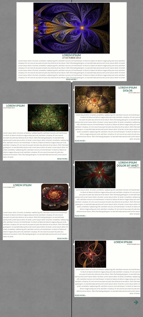
The basic idea behind this template was to create a timeline-like home page. The first post taking up some more space and the next ones alternating sides.
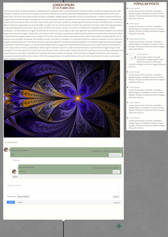
The home page does not showcase any widgets, but if you click on the posts there is a classic sidebar where you can pop in widgets. There is no header but space for a "Brand" in the navbar added.


What you need
Before jumping right into it there's some stuff you need.
- HTML and CSS SkillsObviously. You need to be quite comfortable with HTML and CSS because you are coding a page all by yourself. This is quite an advanced example. If you don't feel ready for this, maybe you want to check out some of my easier responsive template tutorials: Hearts in Wonderland Tutorial | Argyle Creme Tutorial
- A Blogger Testblog with some postsYes, do not build a new template in your existing blog, because you can mess things up quite easily, especially when doing more "experimental" work. Also do add some posts, in which you feature images. Also since this blog works with jumplinks and first images, you want to add jumplinks, and make sure the image is placed somewhere after the jumplink in order for Timelapse to look as intended.
- Color Scheme, Webfonts, Font AwesomeBefore you start you want to have the hint of an idea of the final look. I knew I wanted something modern and more cool-toned. So I chose a background from Subtle Patterns, a Sans Serif Webfont and a Color Palette that seemed to be appropriate for the intended effect. I also wanted to use arrows as page navigators, so I used Font Awesome as well.
- BootstrapBecause I'm a lazy person and don't want to write all the CSS by myself, I'm using Bootstrap to add some basic style. Also Bootstrap does have some very nice components, like the navbar I used.
- FiveNow for the most important thing when writing a blogger template. Oliver, who's the author of the German Tutorial blog 5202 created a blogger base all by himself: five. He rewrote the blog widget and the basic code. What's the major difference to the simple template is the fact that there are not as many div-containers. It is perfect to customize.He does have two different versions out. There is the "classic version" only using the G+-Comments and a version which does also have the old comment form, which I know a lot of people still prefer. If you use the classic version you still can enable the Google Comments, so that's what I used: five classic_comments.
Step 1: Sketching
The first thing you always want to do is create a "sketch" of what you want to build. So a basic structure. You also want to think of a version that does look good on a more narrow screen width. Usually my sketches look like this. But since with this template I wanted to go a step back from the classic look I did include the different articles in my design. I actually created 4 different sketches.
- Wide ScreenWith sketching I like to start off with the "full" look of my site, even though I will code the narrow view first. As said before, I was inspired by a timeline. I knew I wanted to create a blog without a header, so the first post was allowed to take up some more space. I wanted it to be wide and centered whereas the other posts should be hanging on each side of the timeline in alternating order and each post to have a little triangle to point at the line.For the "non index"-pages I wanted to keep up the basic style of the page, so still no header, but a sidebar. The look of the post itself is like the first post on the index page.Codewise I used a basic markup of a all-containing container, with a content-container in which the articles are and a sidebar container, where you can add the widgets. The markup remains unchanged all the time, so actually everything is done using CSS.
- Narrow ScreenI wanted the look of the index page on narrow screens to still have the same feel to it, as the wide version. But because there's not enough space keeping each post on the right and the line remains on the left. The non index pages do not have to be changed a lot, but the sidebar moves from the right of the post to underneath it, as soon as there is not enough space for it anymore.
Step 2: Prep basic code
Okay, now the fun can start. You want to take five and start building your own markup. Include Fonts, CSS's, JavaScripts and make the changes you need. I did adjust some of the code, removed the header and added my container structure. When you're done. Copy your code and log into your blogger. You want to open up the code of your testblog. Delete everything that's in there and paste your HTML. Since you have no CSS in there yet besides Bootstrap it won't look special at all. Just white with your content in there. My mode at this stage look like this:Step 3: Narrow and Wide Screen Style
Next you want to start recreating your sketch in your blog. I find it easier to first get it to work without the media queries. Start with the narrow look and then do the wide look. Combining those and writing the media queries will be done in the next step.- Narrow CSSThe CSS will be placed inside of the template tags.Start with some basic style and then most of the CSS from the sketch can be taken. You want to make sure not to focus to much on the styling. So just use the same colors as in your sketch to see each container and don't bother with other "fancy" stuff such as fonts, sizes or the look of your post-content inside of the article boxes.Five does feature the classes .index .item and .static_page. If you use those classes, the CSS applies only to the specific page type. This does save you quite some writing work so I recommend using it.The CSS for the Blogger Narrow sketch looks like this and the results can be seen as well:


- Wide CSSNow cut all of the CSS and paste it in a document where it won't get lost and work on the wide CSS.For me, this is what it looks like:
Step 4: Combination Narrow and Wide - Media Queries
Okay, now that both views work fine, we want to combine them. What you need to know is when to change the view. I found that the wide CSS does not work if the width is smaller than 1020px on the index page. The sidebar does not look good any more if the width is under 895px. So that's how I'm building the media queries.
With the media queries the CSS looks like this:
Step 5: Style
In the last and final step you do care about all the rest. Now that the basic look is set you can work with colors, fonts background etc. This is when you create the final look of your site.
My final CSS looks like this:
Step 6: Finishing Touches - the navbar
In the end you want to care about little adjustments. I decided to add the navbar to complete the whole look and add some usability. You can now add in your widgets and everything else you like to use. And as soon as you're done, you can use it however you want it. I hope this was of some help to you and maybe you want to accept the challenge and write your next template yourself.


0 Comments